Loading...
Constant Contact Payment Page Redesign
Research
Competitive, customer & non-customer user testing data used to inform hypothesis & defining problem.Product Strategy & Vision
Worked with PMs & Senior Leadership to prioritize our approachDesign
Sketching, wireframing, user-flow definition & high-fidelity UI design.Project Details
- Client: Constant Contact
- Prototype: trends_prototype_V3
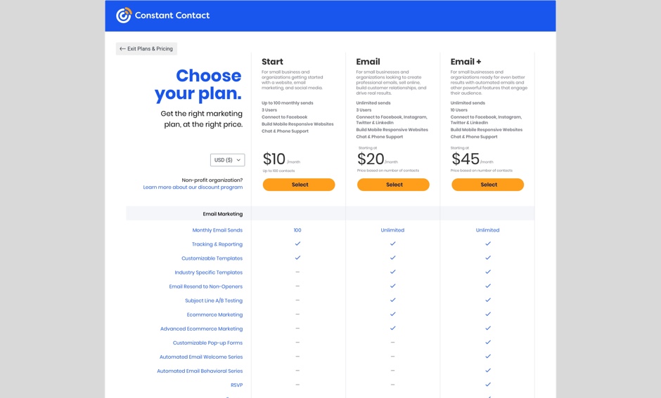
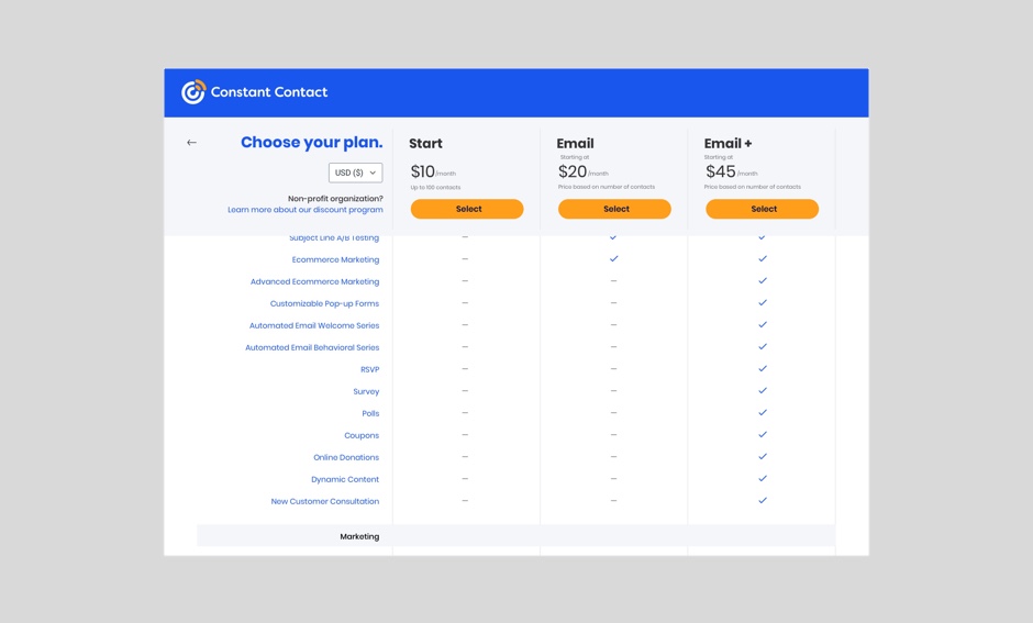
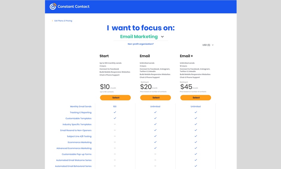
New designs for the Constant Contact payment & pricing experience, with the intent to surface feature value with a more intuitive UI & clearer messaging.
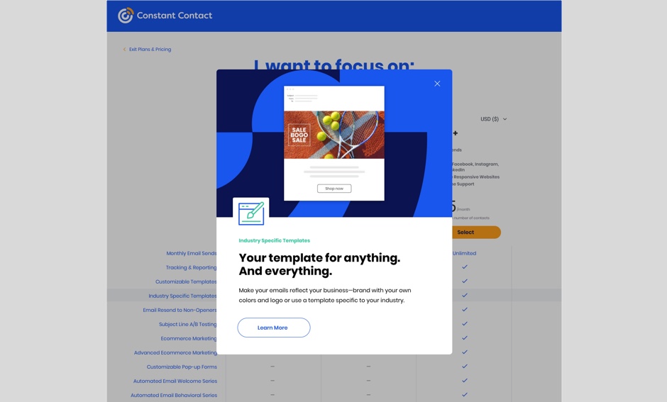
I designed these options with the goal to keep pricing & feature-overviews visible even while scrolling, & allowing users to see more details through the use of a dialog, instead of taking them to a new page each time they decide to "click."
I worked with our data-team to gather quantitative data related to usage of our pricing page, & lead the initiative with my PM to campaign for this feature improvement within senior leadership, & to get this added to our product roadmap.


