Basket™ Shopping App
Research
Competitive, customer & non-customer user testing data used to inform hypothesis & defining problem.Strategy & Vision
How does this appeal to potential customers, & in turn, how could this be monetized?Design & Motion
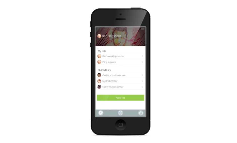
Sketching, wireframing, user-flow definition & UI artifacts, & demo video of basic functionality.Basket™ is an app intended to simplify & streamline normally tedious & inefficient trips to the grocery store.
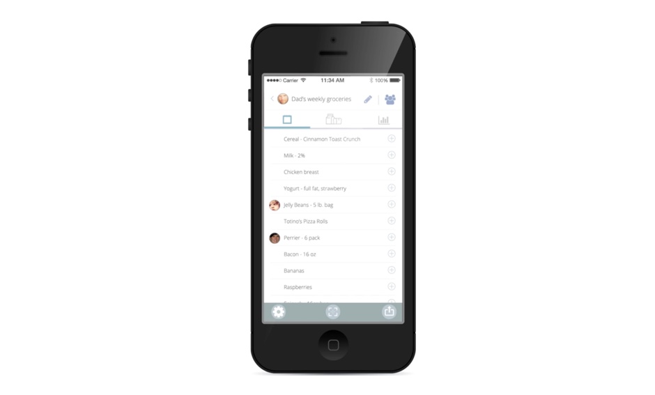
How do we create an app that is as easy to use as pen & paper, but offers key functionality that surfaces immediate value to shoppers based on a simple & straightforward UI & workflows that contribute to adoption & continued use?
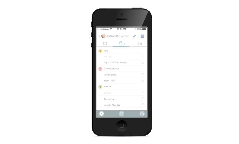
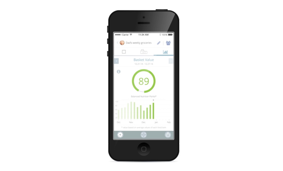
Taking into consideration the basic concepts of making a list, & including simple swipe functionality, coupled with more features like sharing a list with family members & "closing" a list to avoid new items being added after checkout, contributed to positive qualitatative feedback among test users, & quantitative feedback during unmoderated sessions suggested the UI was intuitive & the controls created a low-friction experience The added ability to scan items to collect potential nutritional value, & creating diet goals & comparing weekly nutritional data, was also positively receieved by users & this functionality was placed near the top of "must have" functionality in almost all card-sorting exercises among users.


