Loading...
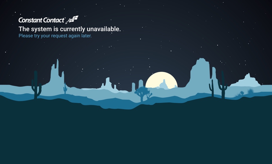
Universal Error Page Redesign
Education & Discovery
Taught myself how to build the parallax effect using CSS & JavascriptPrototyping & Animation
HTML, CSS, & JS working proof of concept.Product Strategy & Vision
Worked with PMs & Senior Leadership to prioritize this in our product.Project Details
- Client: Constant Contact
- Demo: Parallax error page
New error-page design. Using CSS to create horizontal-parallax effect. Errors are not ideal, but these pages should still be a consideration, & part of a cohesive experience.
I took cues from sites like Github and Mailchimp that show they consider 404 and other error pages with the same concern as "happy path" experiences.
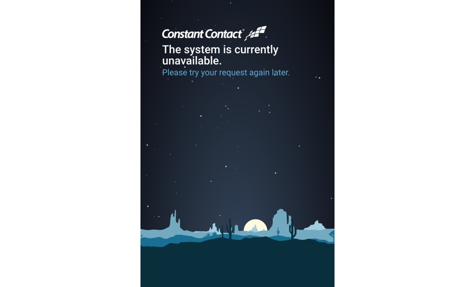
The most difficult part of this project was getting buy-in from senior leadership to dedicate developer time to this, so I took it upon myself to build the parallax effect and animation myself as a proof of concept. The next hardest part was making sure the animation would scale properly across a variety of device form factors, and not over-tax the device with the animation.

